Good Product Enhancer prompts are the difference between a phone snap and a campaign image. Type "make it nice" and you get a shrug. Give the enhancer real art direction and you get a product photo you would happily put ad spend behind. This guide covers the prompt formula and a copy paste library so you never stare at a blank box again.
The premise is simple: the AI is not a mind reader, it is a very capable assistant that does exactly what you describe. When founders complain that AI product photos look "fake" or "generic," the problem is almost never the model. It is the brief. A vague prompt produces a vague image. A specific, structured prompt produces a directed one. Once you internalize the formula below, you can stage any product, in any niche, in under a minute, and you can do it consistently across an entire catalog so your store reads as one coherent brand instead of a pile of mismatched uploads.
The three modes, fast
- Remove background gives you a clean cutout. No prompt needed. Do this first.
- Upscale adds sharpness and resolution. No prompt needed. Do this last.
- Lifestyle is the creative one. This is where your prompt matters, because it stages your real product inside a generated scene while keeping the product untouched.
It helps to think of these three as a pipeline rather than three separate buttons. Remove background isolates the subject so nothing from your messy kitchen counter bleeds into the final shot. Lifestyle builds the world around that isolated subject. Upscale then takes the finished composition and adds the resolution you need for a full-bleed hero banner or a print-quality ad. Run them out of order and you fight the tool. Run them in order and each step makes the next one easier.
Why Lifestyle keeps your product untouched
This is the part that trips people up the first time. With most generic AI image generators, the model invents the product too, which means your real label, your real bottle shape, and your real color get redrawn into something that no longer matches what ships to the customer. That is a problem, and not a small one. The Lifestyle mode here works differently: it preserves your actual product pixels and only generates the environment around them. Your label stays your label. The shape that arrives in the customer's hands is the shape they saw in the ad. That fidelity is what makes these images safe to use as real product listings, not just mood boards.
The prompt formula
Every strong Lifestyle prompt has four parts, in this order.
surface, lighting, background, style
- Surface: what the product sits on. Polished marble, raw oak table, matte concrete pedestal, wet river stone.
- Lighting: the biggest driver of expensive looking photos. Soft morning window light, warm golden hour, single soft studio light.
- Background: keep it blurred and simple. Blurred neutral background, out of focus cozy interior, deep shadow backdrop.
- Style: the finishing instruction. Editorial product photography, luxury minimal, lifestyle with shallow depth of field.
Skip a part and the result drifts generic. Include all four and it looks directed.
Why the order matters
The order is not arbitrary. The surface establishes the physical context the product lives in, so the model knows how the base of your product should meet the world and how reflections and contact shadows should behave. Lighting comes second because it is, by a wide margin, the single biggest difference between an amateur photo and an expensive one. Cheap photos are flat and evenly lit; expensive photos have a clear light direction, soft falloff, and intentional shadow. Background comes third because it sets depth and mood without competing for attention, which is why "blurred" and "out of focus" appear in nearly every good prompt. Style comes last because it is the overall finishing instruction that ties the first three together into a recognizable genre of photography. Read your prompt back in that order and it should sound like a brief you would hand a real photographer.
The prompt library, with before and after
1. Clean editorial
on a polished Carrara marble surface, soft natural morning light from the left, blurred neutral background, subtle realistic shadow, editorial product photography
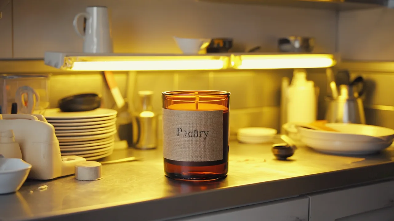
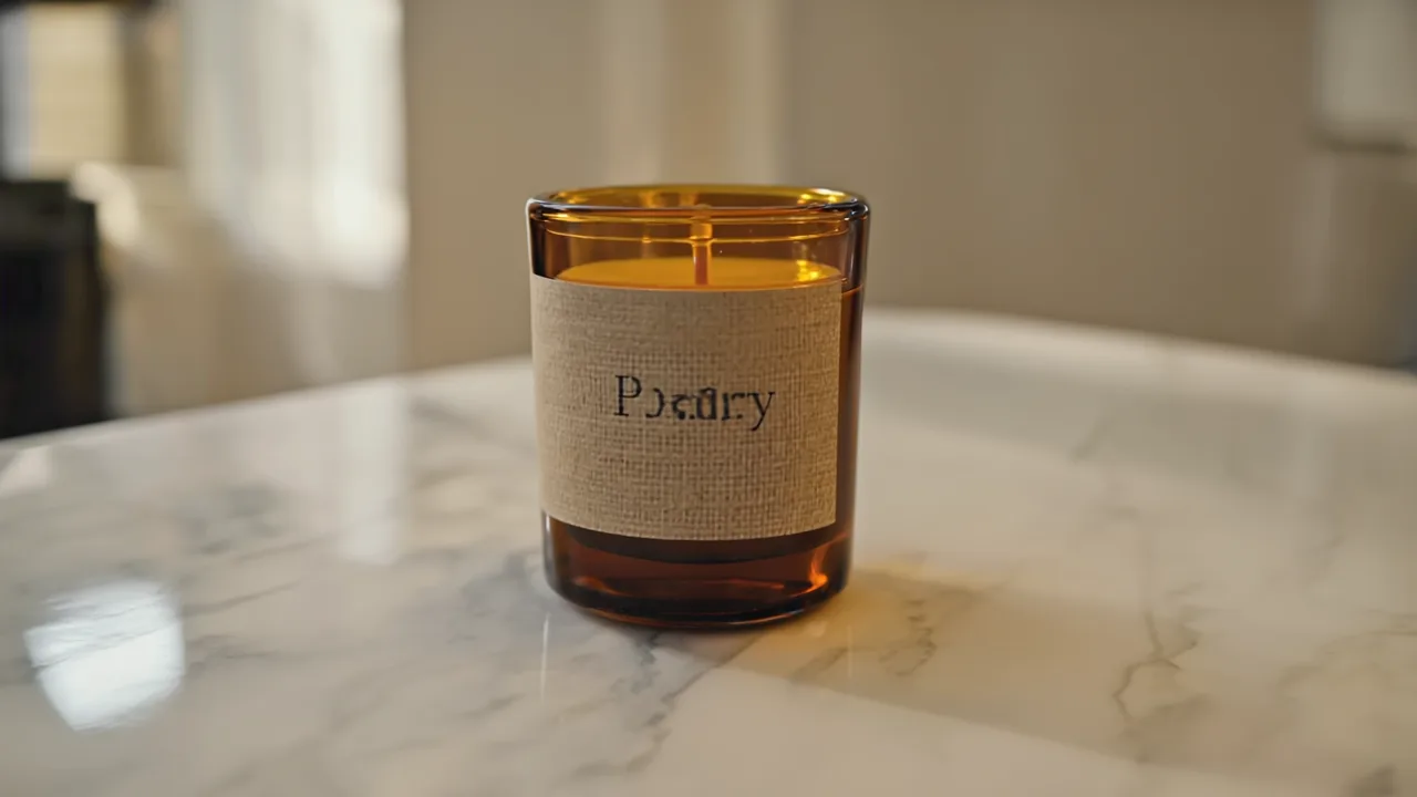
This is the workhorse. Marble plus soft morning light plus a neutral blur reads as clean, premium, and trustworthy across almost any category, which is why it is the prompt to start with when you are not sure what your brand should look like yet. It flatters skincare, candles, jewelry, supplements, ceramics, and stationery without modification. If the result feels too cold, swap "Carrara marble" for "warm travertine" and "morning light" for "soft afternoon light." Small word changes here move the whole mood.
2. Warm lifestyle
on a rustic wooden cafe table, warm afternoon golden hour light, blurred cozy interior in the background, shallow depth of field, lifestyle product photography
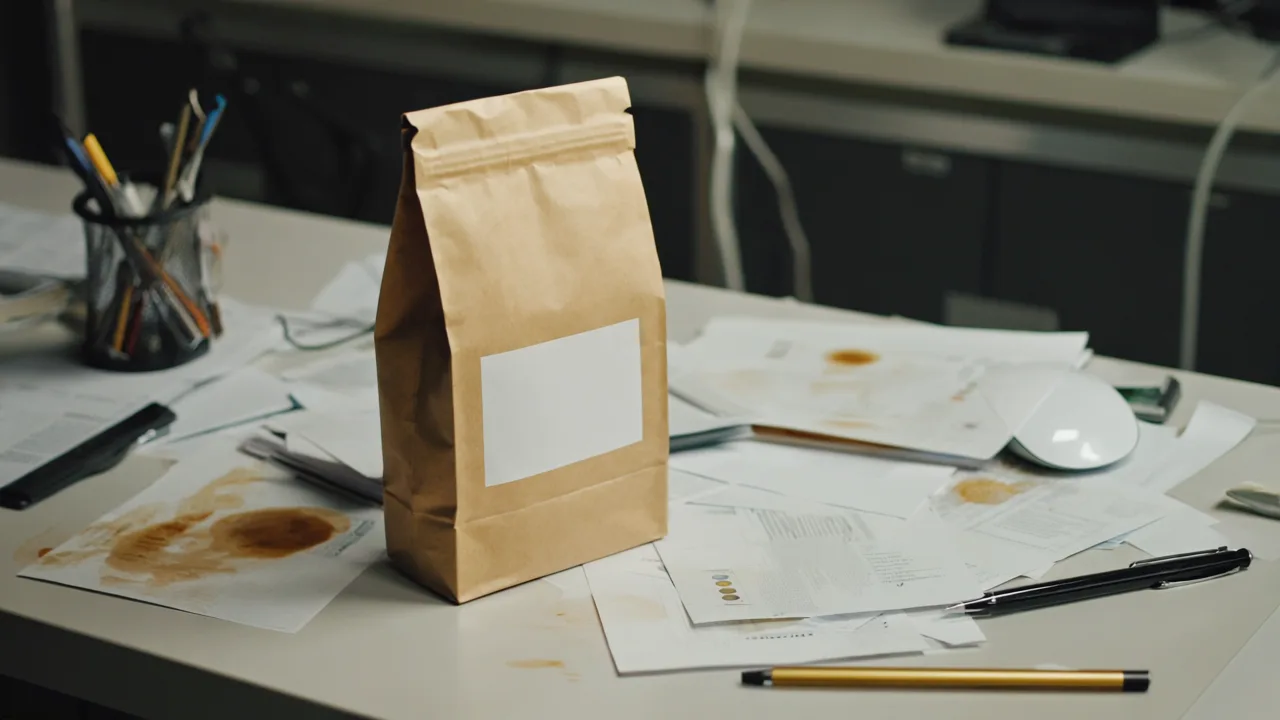
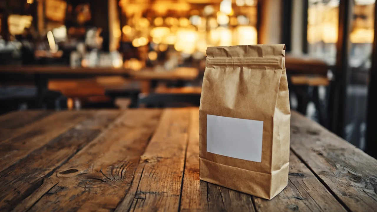
Use this when you want the customer to imagine the product in their own life rather than admire it on a pedestal. Golden hour light and a cozy blurred interior signal comfort and approachability, which is why it works so well for food and beverage, coffee, candles, home fragrance, and anything wellness adjacent. It is the prompt that makes a $14 product feel like a small indulgence. The shallow depth of field is doing real work here: it isolates the product while implying a whole warm room just out of focus behind it.
3. Premium minimal
on a matte concrete pedestal, single soft directional studio light, deep neutral shadow background, luxury minimal product photography
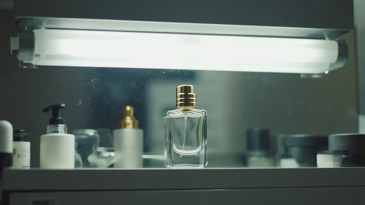
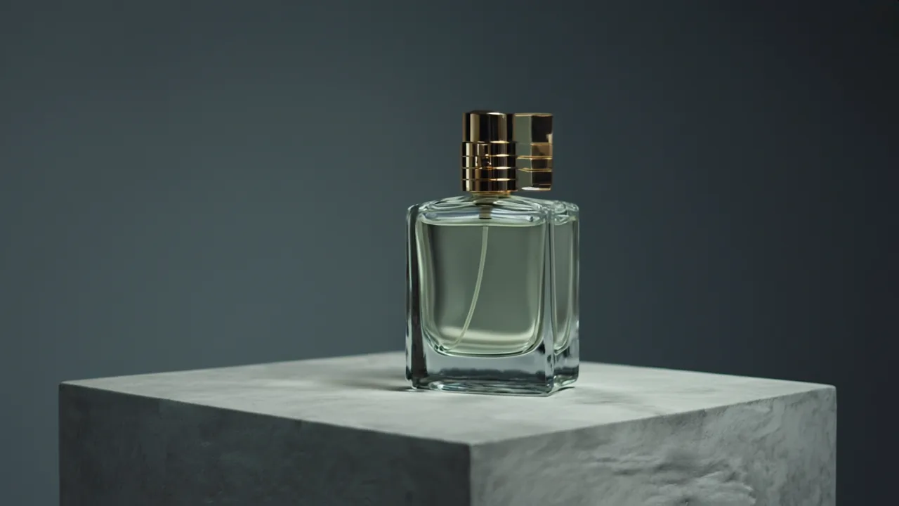
This is the high-end, fashion-house look. Concrete, hard-edged directional light, and a deep shadow background read as expensive, modern, and a little austere. It suits tech accessories, fragrance, eyewear, watches, sneakers, and any product whose whole pitch is restraint. Be careful with it on soft or cozy categories, where the coldness can fight the message. When in doubt, generate the same product with prompt one and prompt three side by side and your eye will tell you instantly which brand world the product belongs in.
Three more prompts to extend the library
Once you understand the formula you can author your own, but here are three more proven starting points to widen your range:
- Outdoor natural:
on a wet river stone beside a stream, bright overcast daylight, blurred green forest background, soft natural shadow, organic lifestyle product photography— built for outdoor gear, sustainable goods, and natural cosmetics. - Bright and airy:
on a white linen surface near a window, soft diffused daylight, blurred bright neutral background, gentle realistic shadow, clean minimal product photography— the bright, optimistic look for baby, beauty, and home goods. - Moody dramatic:
on a dark slate surface, single dramatic side light, deep black shadow background, high contrast, cinematic product photography— for spirits, premium coffee, and anything that wants gravity.
A step-by-step methodology
Prompts are the ingredients. Here is the actual recipe for turning a folder of phone photos into a consistent, ad-ready catalog.
- Shoot a clean source. The AI staging is only as honest as your input. Place the real product on a plain surface, fill the frame, avoid harsh overhead glare, and shoot the angle a customer cares about. You do not need a good background, you need a clear product.
- Remove the background first. Run remove-background to get a clean cutout before you do anything creative.
- Pick one prompt as your house style. Choose the prompt above that matches your brand and commit to it across the whole catalog. Consistency is what separates a real store from a flea market.
- Generate two or three variations of each product on that house style and keep the best.
- Upscale the winners last so they hold up at hero-banner and ad sizes.
- Drop them into the store and the marketing. The same images become your product listings, ad creative, social posts, and email headers.
The whole point is repeatability. A studio photographer charges per shot and you are at the mercy of their calendar. This pipeline lets you reshoot the entire catalog the day you change a product, a price, or a brand direction, for free, in the time it takes to drink the coffee in your warm-lifestyle prompt.
Common mistakes and edge cases
- Cramming the prompt with adjectives. More words is not more direction. Five precise nouns and one clear lighting instruction beat a paragraph of "stunning, gorgeous, ultra-realistic, 8K, award-winning." Stick to the four-part formula and stop.
- Forgetting the shadow. Without a named shadow the product floats and looks pasted on. "Subtle realistic shadow" is the single highest-leverage phrase you can add.
- Mismatching scene and product. A rugged hiking boot on Carrara marble reads as a mistake. Match the surface and lighting to the world the product actually lives in.
- Reflective and transparent products. Glass, chrome, and mirrored packaging are the hardest case because the scene reflects in them. Favor softer, diffused lighting ("soft directional studio light" over "single dramatic side light") and a simpler background so the reflections stay clean.
- Tiny or detailed products. For jewelry, electronics components, or anything with fine detail, upscale matters more than usual. Build the scene, then upscale aggressively so the detail survives at full size.
- Changing the house style mid-catalog. If product one is warm cafe light and product two is cold concrete, the store looks borrowed from two brands. Pick one and stay there until you deliberately rebrand.
Pro tips that separate good from great
- Remove the background first. A clean cutout gives the Lifestyle scene a cleaner product to stage.
- Match the scene to your brand, not the trend. Wellness on warm wood, tech on cold concrete. Consistency across the catalog reads as a real brand.
- Name the shadow. Adding "subtle realistic shadow" anchors the product to the surface so it does not look pasted on.
- Upscale last. Build the scene, pick the winner, then sharpen for banners and ads.
- Generate two or three variations and choose the best. Still cheaper than one studio shot.
- Steal from the surface, not the trend. If a competitor's hero shot looks expensive, look at what their product sits on and how the light falls, then describe that surface and light in your own prompt. You are borrowing a technique, not copying an image.
- Keep a prompt notebook. The moment a prompt produces a great result, paste it somewhere you can reuse it. Your house style should be a saved sentence, not something you reinvent every session.
Matching prompts to your niche
The fastest way to land a house style is to start from your category instead of a blank box. Lighting and surface carry an enormous amount of unspoken meaning, and customers read those cues before they read a single word of copy. A few reliable starting points:
- Skincare and beauty: bright and airy or clean editorial. Soft diffused daylight on marble or white linen signals purity and gentleness, which is exactly the promise most beauty brands are making.
- Coffee, food, and beverage: warm lifestyle. Golden hour on rustic wood with a blurred cozy interior makes the product feel like a ritual rather than a purchase.
- Tech, eyewear, and accessories: premium minimal. Concrete and hard directional light read as engineered and modern, which is the entire pitch for most hardware.
- Outdoor, sustainable, and natural goods: outdoor natural. River stone and overcast forest light tell the customer the product belongs in the world it claims to protect.
- Spirits, premium coffee, and luxury: moody dramatic. Dark slate, side light, and a deep black background create the gravity that justifies a higher price.
None of these are rules you must obey, but they are sensible defaults. If your brand has a genuine reason to break the pattern, break it deliberately and consistently. The worst outcome is an accidental mix, where half the catalog is cozy and warm and the other half is cold and minimal for no reason a customer can perceive.
From photo to a finished store
Great product photos are necessary but not sufficient. The reason the Product Enhancer matters is that it is one piece of a larger pipeline that takes a plain-English idea and turns it into a live business. Once your catalog looks like a real brand, the same platform handles the storefront, the legal docs, supplier connections, and the marketing that drives traffic to those beautiful new images. The photo is the hook, but the hook only pays off if there is a trustworthy store and a working checkout behind it.
That is why the advice to "pick one house style" is really brand advice in disguise. A consistent visual language across your product grid, your hero banner, your ads, and your email is the cheapest credibility you can buy, and with this workflow it costs nothing but a few minutes of art direction. A founder who nails this looks established on day one, which shortens the gap between launching and earning trust. Start with one strong photo, extend it to the catalog, then let the rest of the platform carry that polish through to a finished, sellable store.
Frequently asked questions
Does the Product Enhancer change my actual product?
No. Lifestyle mode preserves your real product pixels and only generates the environment around them. Your label, packaging shape, and color stay exactly as they are, which is what makes these images safe to use as real listings instead of just inspiration. The scene is generated; the product is yours.
How many prompts do I need for a whole store?
One. Pick a single house-style prompt that fits your brand and run every product through it. That consistency is the entire point. You only reach for a second or third prompt when you have a distinct product line that genuinely belongs in a different world, such as a premium tier you want to feel cooler and more minimal than the core range.
What makes an AI product photo look fake, and how do I fix it?
Three things, in order: a floating product with no contact shadow, lighting that is flat and directionless, and a background so busy it competes with the product. Fix all three by naming a "subtle realistic shadow," specifying a clear light direction ("from the left," "single soft studio light"), and keeping the background "blurred" and "neutral." The four-part formula bakes these fixes in automatically.
Can I use these images in paid ads?
Yes. That is the design intent. Because the real product is preserved, the image you advertise matches the product that ships, so you are not creating a misleading ad. Build the scene, upscale it for resolution, and the same file works as a product listing, an ad creative, a social post, and an email header.
What should I do if the result still looks off?
Start by checking your source photo, since AI staging cannot rescue a blurry, badly lit, or partially cropped input. Then simplify the prompt back down to the four parts and remove any extra adjectives. Then generate two or three variations rather than judging a single roll of the dice. Most "bad" results are a busy prompt or a weak source, not a limitation of the tool.
Do reflective or glass products work?
They work, but they are the hardest case because the generated scene reflects in the surface. Use softer, more diffused lighting and a simpler background so the reflections read as clean rather than chaotic, and lean on a couple of extra variations to find the cleanest one. Matte products forgive almost any prompt; glossy and mirrored products reward restraint.
Is this actually cheaper than a studio shoot?
Dramatically. A studio shoot charges per setup and per shot, requires scheduling, and has to be redone every time your product or branding changes. This pipeline lets one person reshoot an entire catalog in minutes whenever something changes, which is exactly how a solo founder out-merchandises brands with full creative teams.
Put the photos to work
Once the catalog looks the part, the photos earn their keep across hero banners, ad creative, social posts, and email headers. This is the same engine behind turning static photos into $10K photoshoots, and it is how a solo founder out merchandises brands with full creative teams. Pair it with a clean storefront and you remove the two biggest reasons new stores look untrustworthy.
It is worth zooming out for a second on where this fits. Zentrix turns a plain-English business idea into a complete, live e-commerce business in minutes, including the brand, the store, the legal docs, the suppliers, and the marketing. The Product Enhancer is the piece that makes the storefront look like a real brand instead of a side project, and it is free to start. You do not need to learn photography, hire a studio, or buy lighting gear. You need a phone photo and a four-part prompt.
Open the Product Enhancer, grab your worst product photo, and run the clean editorial prompt. That is your first studio grade shot, free.
Who this is for: anyone using Zentrix to merchandise a store who wants pro grade product photography without learning photography or paying for it.